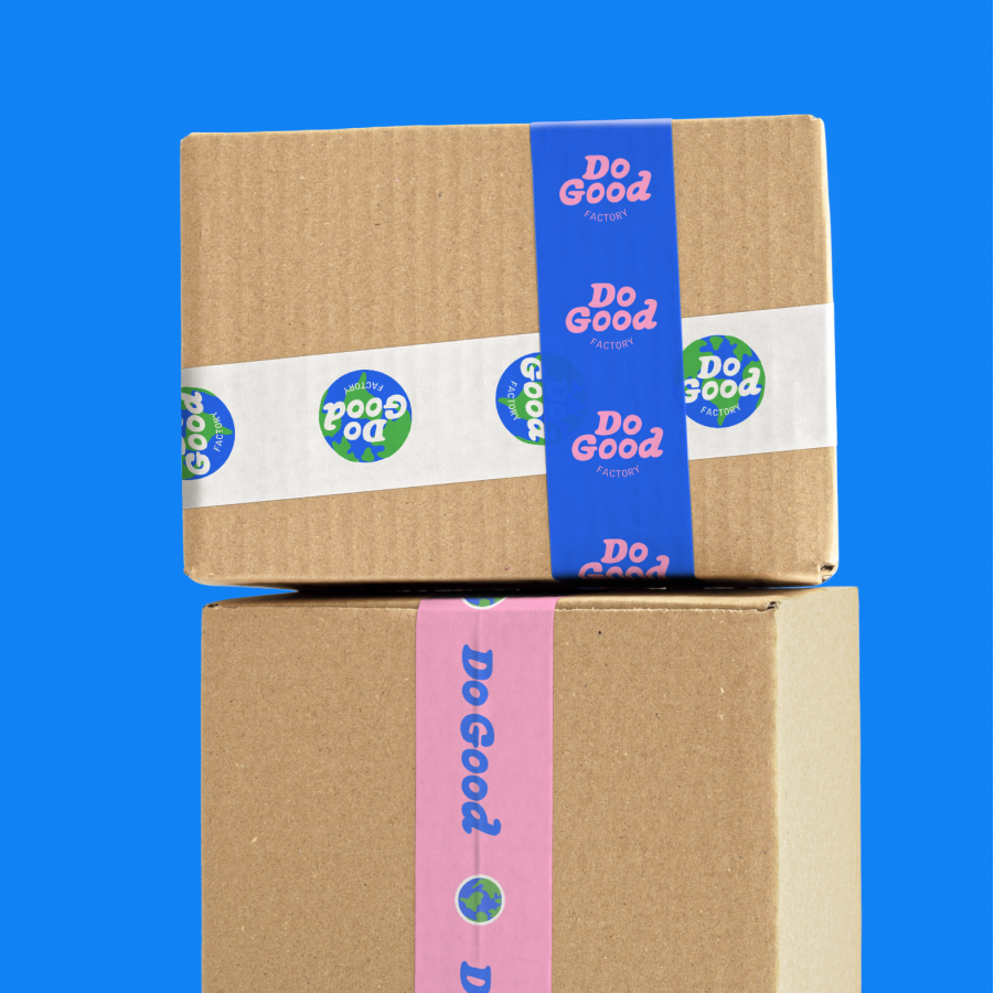


Good.Store
BRANDING DESIGN
We created a full brand identity for Good.Store via our one week Branding Intensive.
Good.Store is a subscription service supplying various products with one mission: to do good. This mission encompasses directing all profits to charity, ensuring ethical supply chain practices, fostering community engagement, and delivering a delightful customer experience. The name "The Good Store" is not just a label, but a reflection of its dedication to making a meaningful difference in the world through responsible business practices and philanthropy.

Brand Design
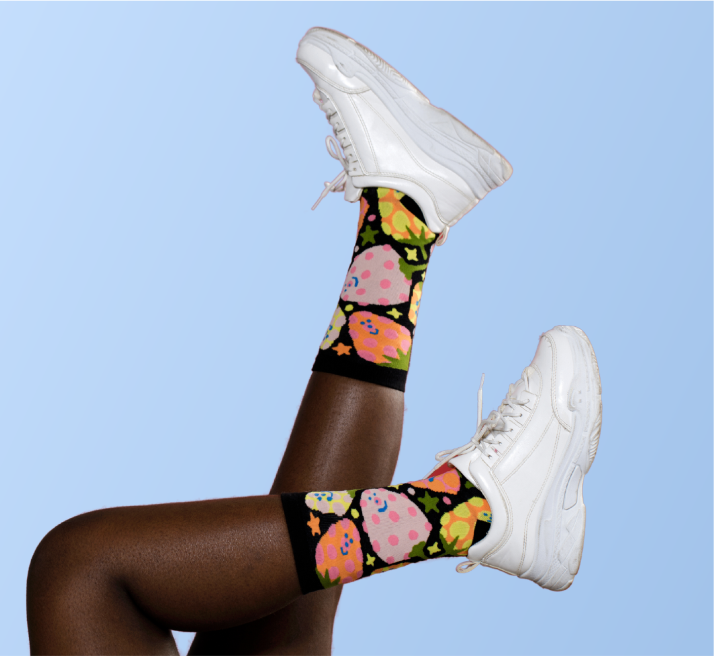
Our goal with Good.Store’s branding was to create a warm, inviting, and playful brand experience that resonates with a socially conscious and diverse audience. We opted for a visual language that was bold and colorful, putting a modern spin on retro inspired aesthetics. When choosing the color palette and type system, we aimed for something professional and sophisticated, yet packed with personality.
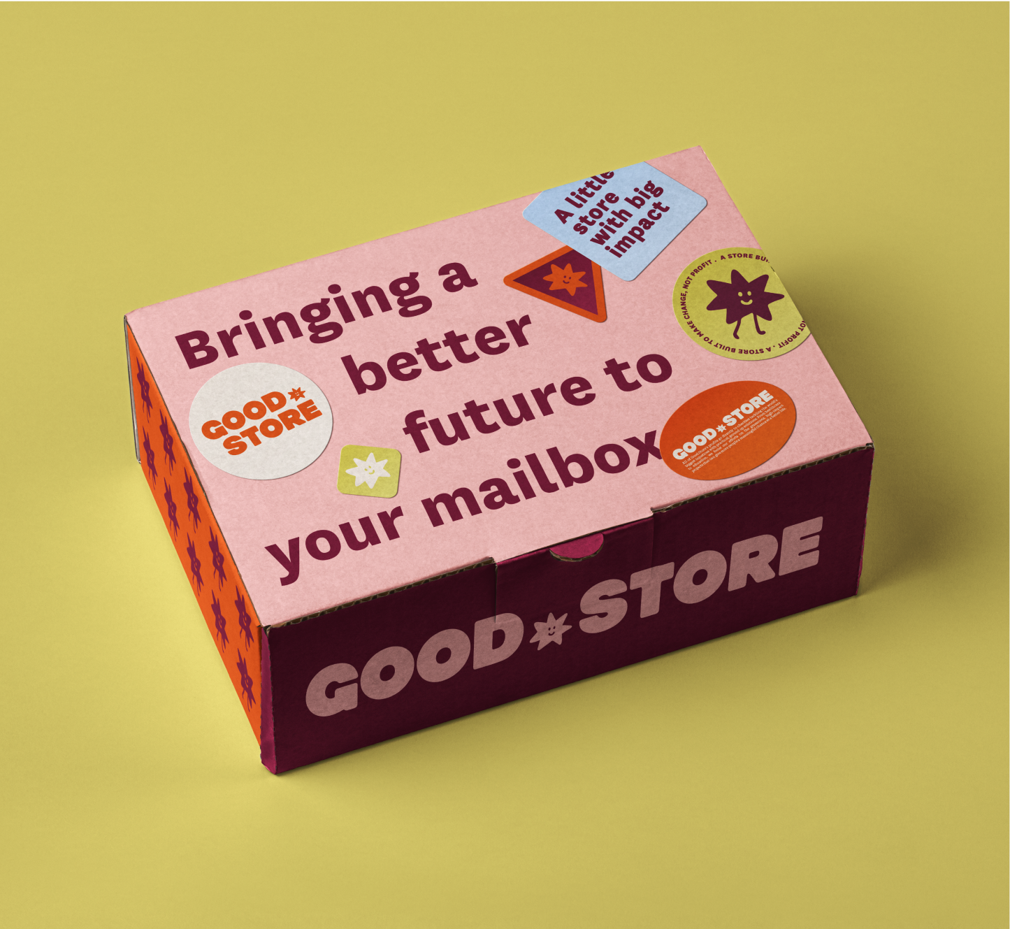
Illustration
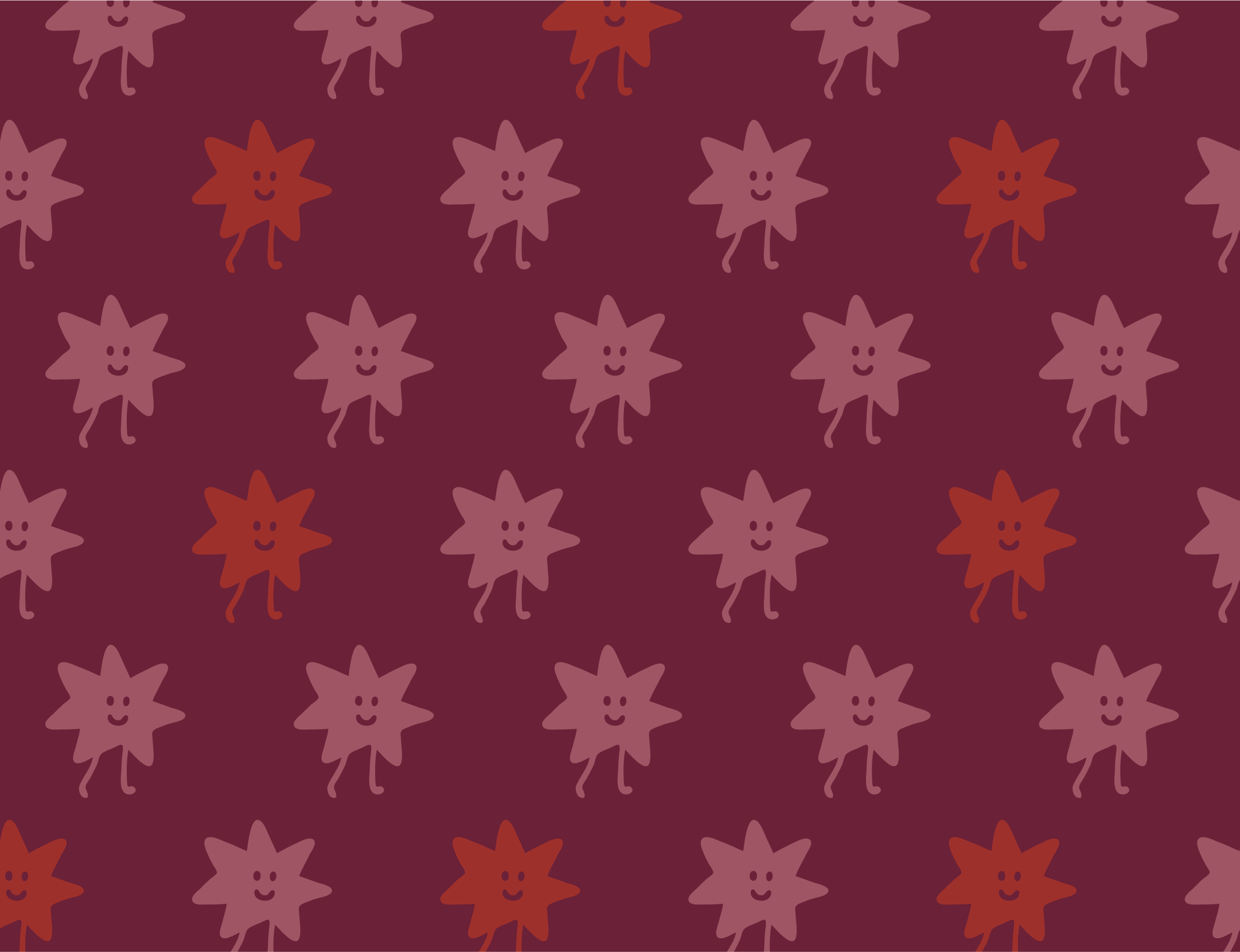
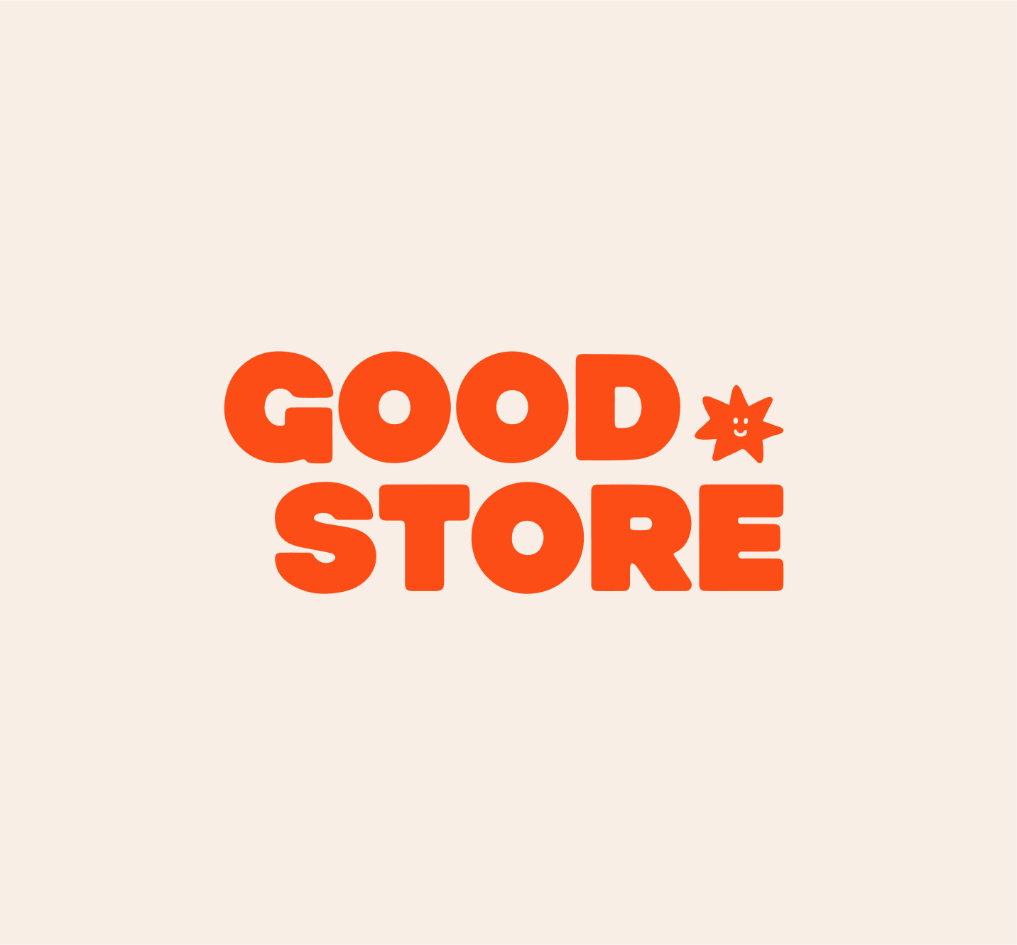
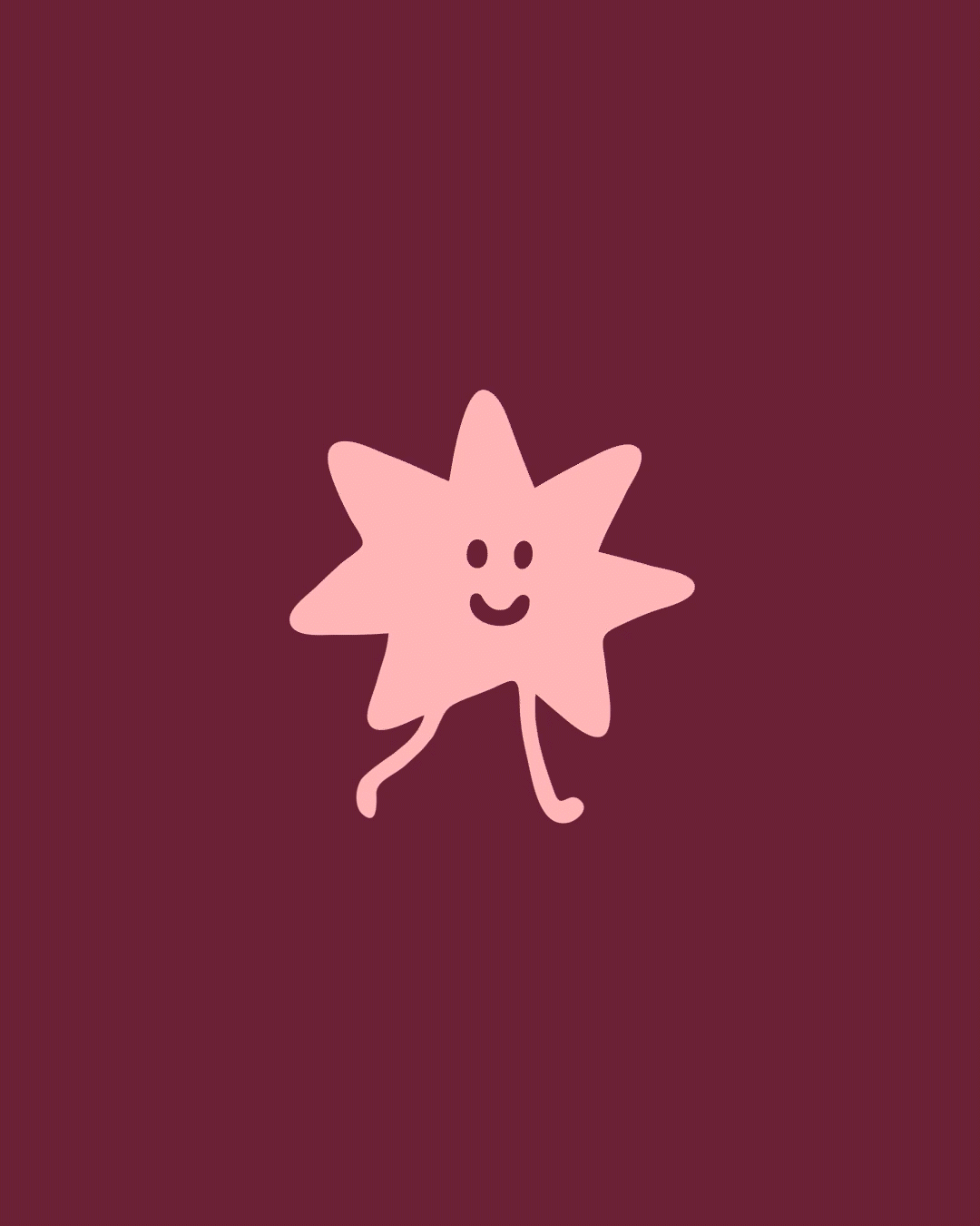
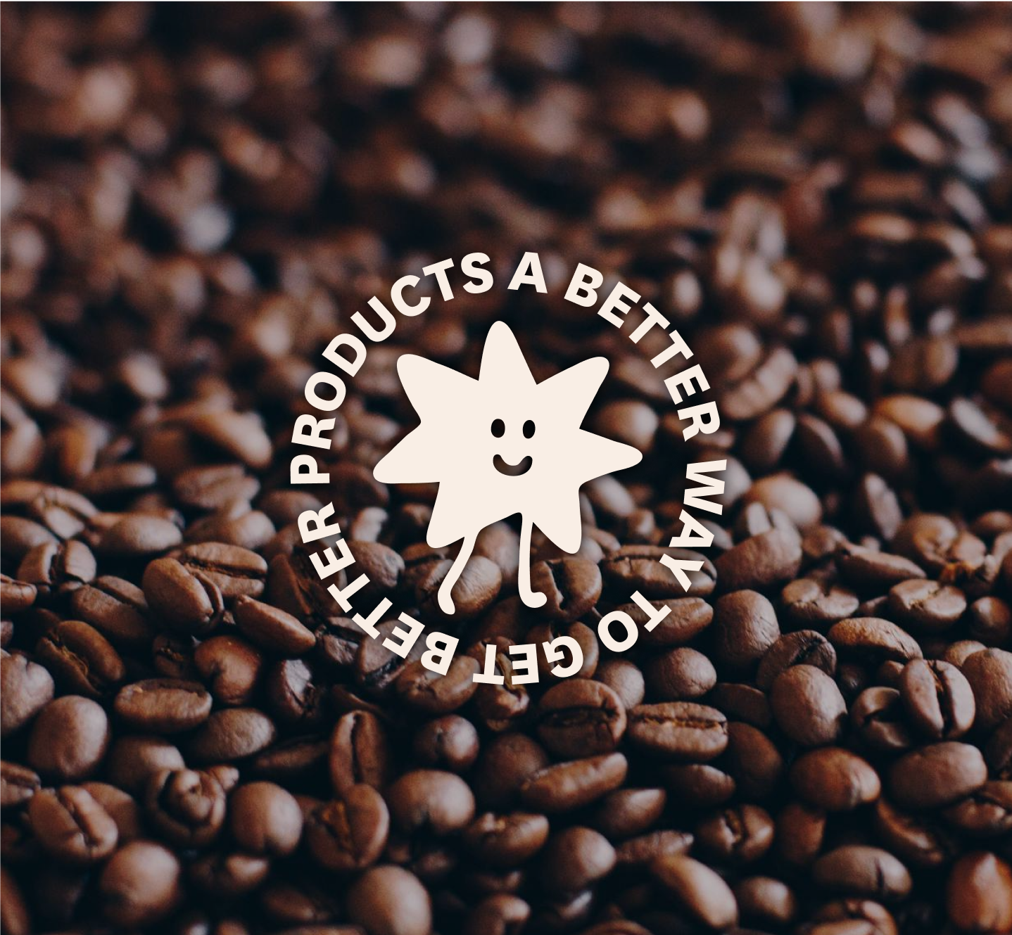
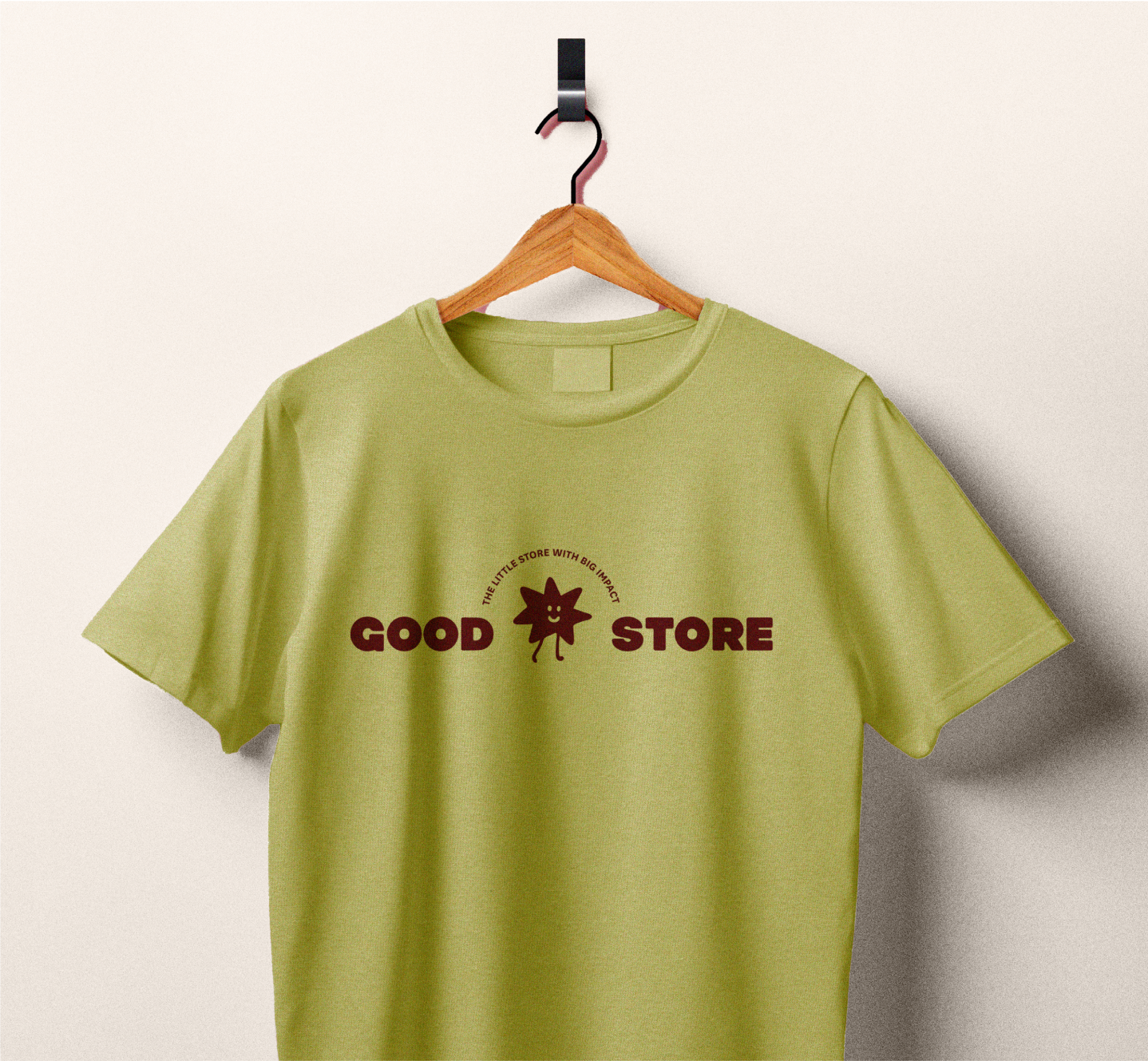
The period in Good.Store’s name is significant, as a period is a grammatical indication to pause and think. Being thoughtful is a huge part of the brand, including considering where money is going to, where the products are coming from, and how products are made. In order to highlight this concept, we created an illustrated character named “Dot” to act as the logo’s period, as well as the brand’s submark.
Dot is a stylized star (both literally and figuratively). A star is symbolic of many things we felt resonated with the brand’s story and values, including brightness, positivity, approval, success, science, and discovery.