

Monthly
BRANDING, FABRIC PATTERN DESIGN, & SOCIAL MEDIA TEMPLATES
We created a brand identity for Monthly, along with a fabric pattern and Pantone swatches for their debut collection as part of a Branding Intensive.
Monthly is the first gender-inclusive periodwear brand creating access to period products. In discovery, our study of mainstream LGBTQ+ brands uncovered an opportunity for a more editorial approach that we balanced with warmth and accessibility to complement Monthly’s mission to end period poverty. The angled “o” in the primary logo stands as a subtle, sophisticated nod to the brand’s promise to fight against societal norms in the name of individual identity.
Because people bleed
Because people bleed
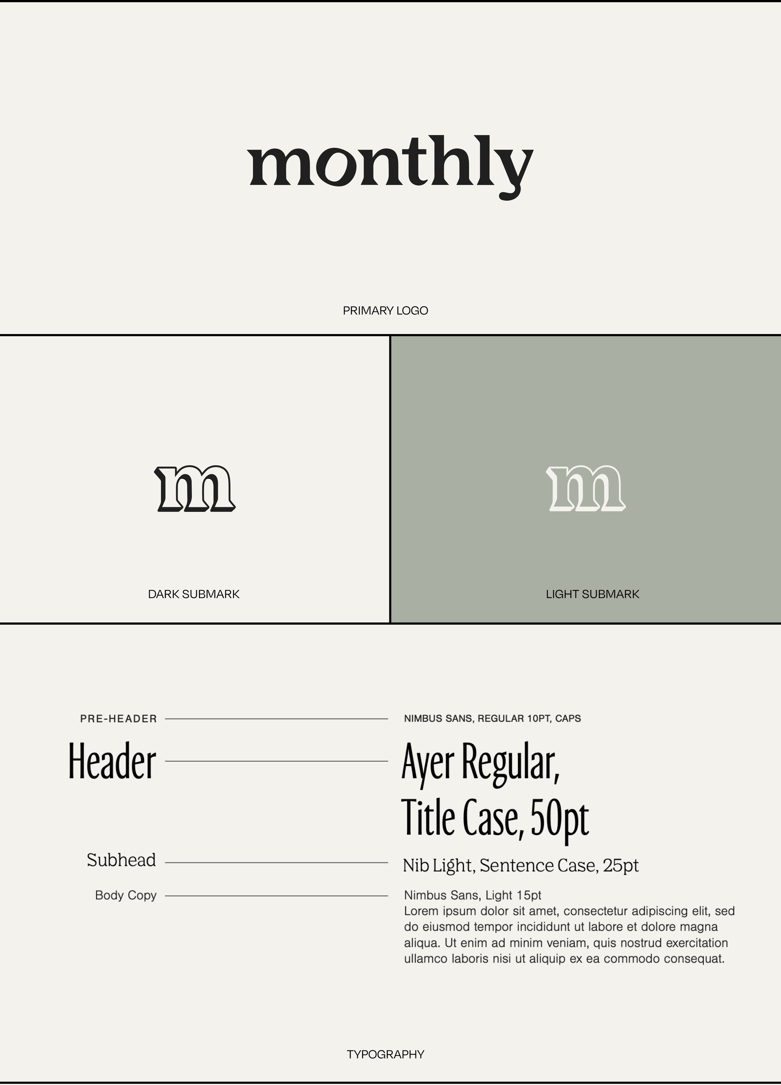
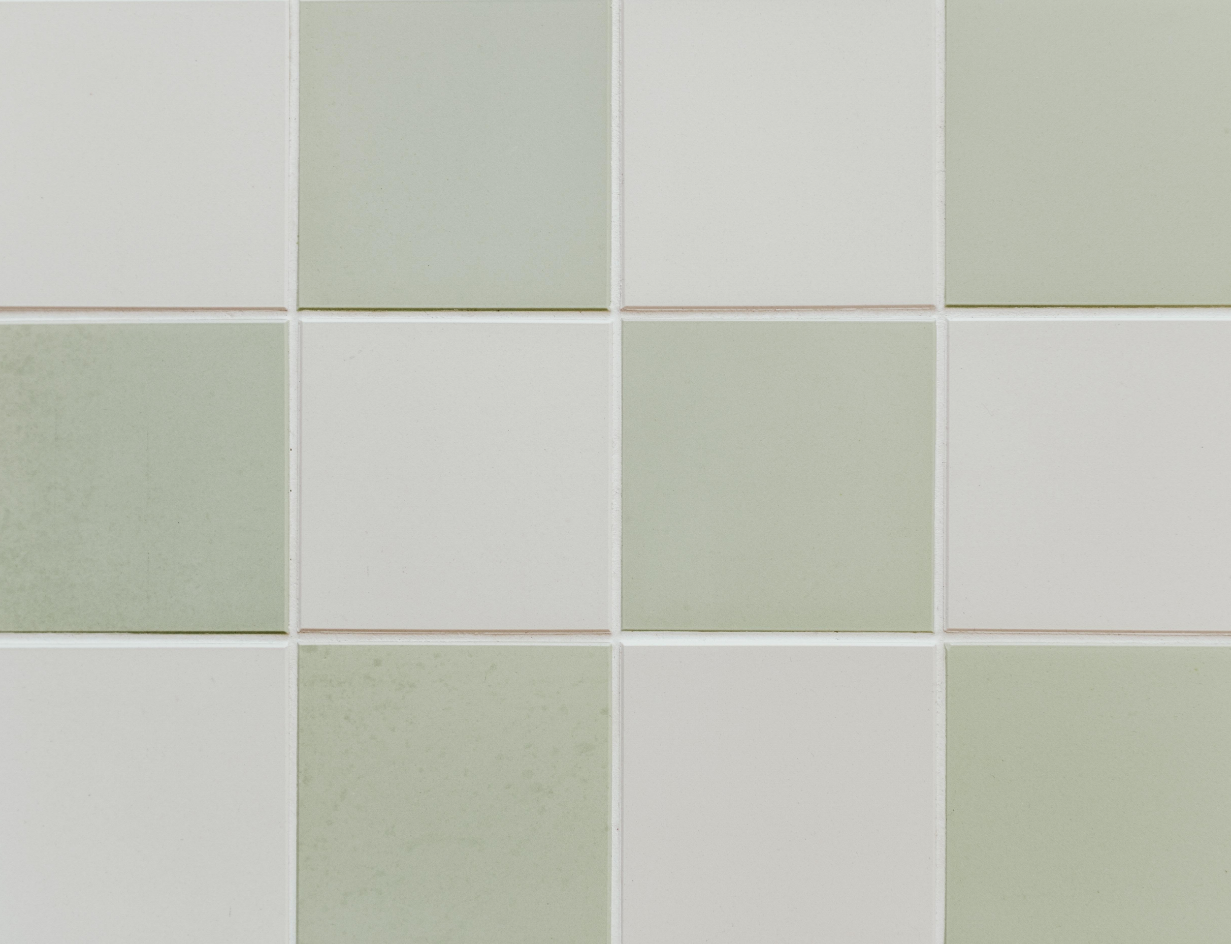
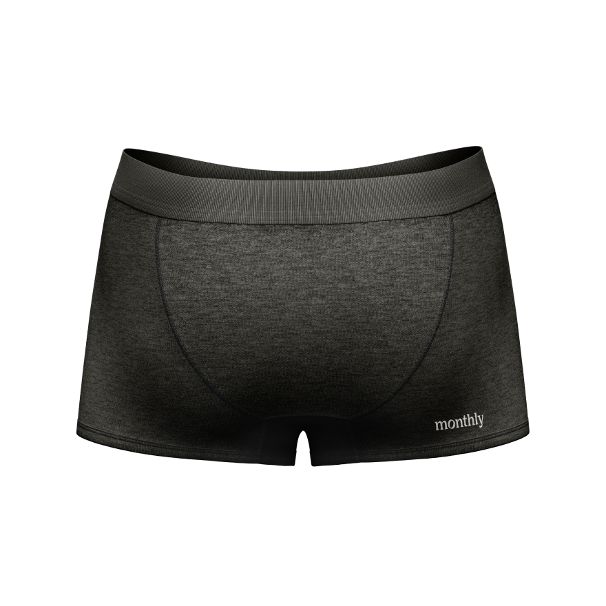
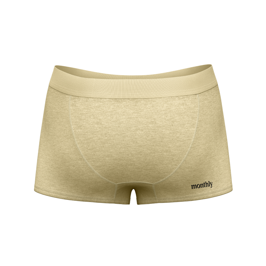
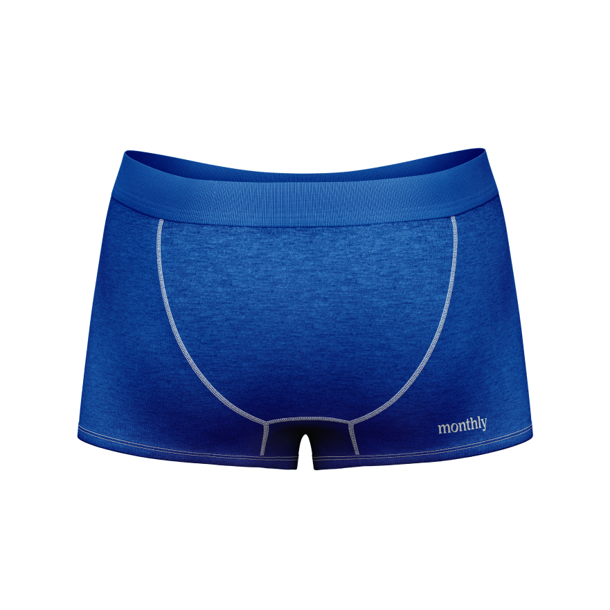
Monthly’s premiere periodwear line needed simple, elevated patterns and colors that appealed to all while working on both a high-waisted cut and the first-ever menstrual boxer briefs. Care went into every detail, even discreet logo placement.


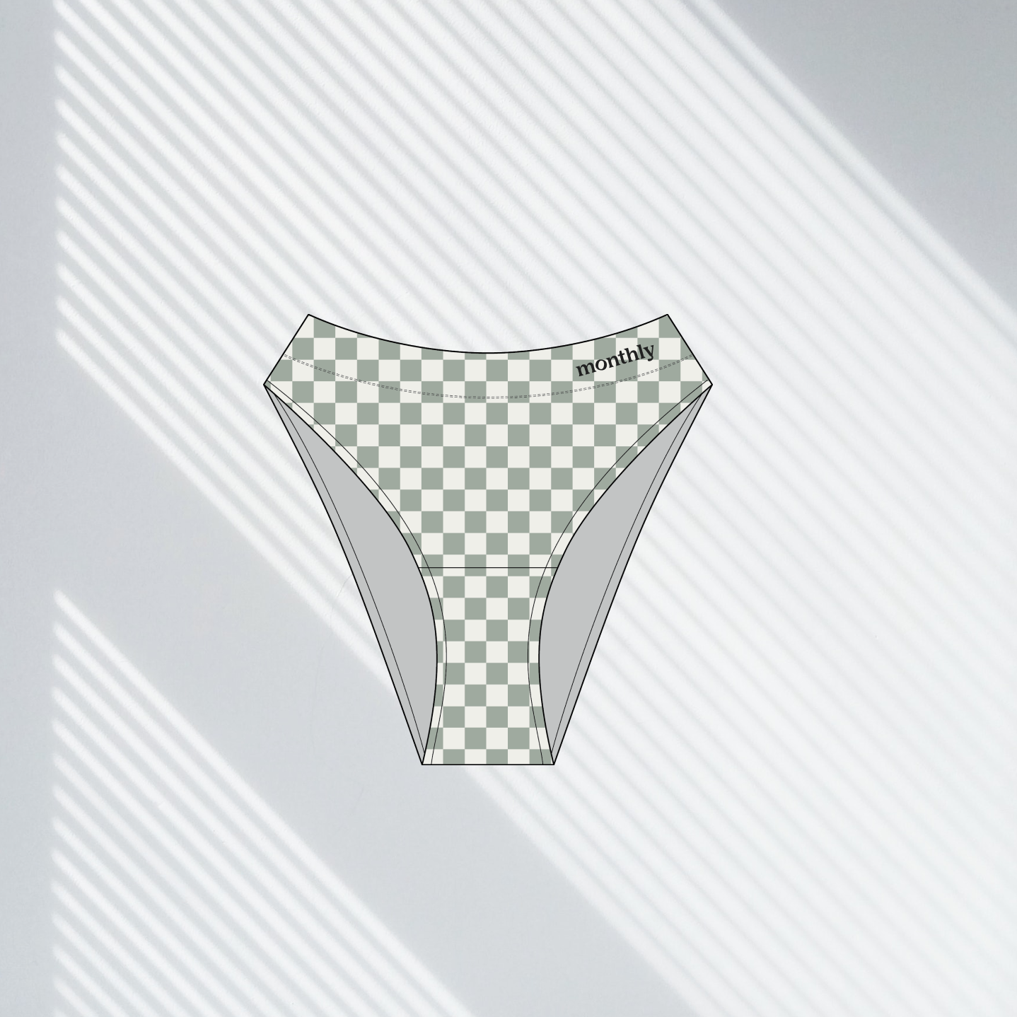

With the remaining time from our 2 Day Branding Intensive, we manually selected Pantones and mocked up the collection for Monthly’s initial product launches.


Social media via a Design Day
Over the course of a Design Day, we planned a month’s worth of social media content, including Story templates and a feed mockup. We helped identify Monthly's brand pillars: Gender Inclusivity, Sustainability, and Period Poverty Awareness, then built graphics that expanded the toolkit from the Branding Intensive process. We finished the day by setting up a social media management system Monthly could operate on their own.


Peruse more projects and collaborations
with other incredible clients