
Grit City
BRANDING & PACKAGING

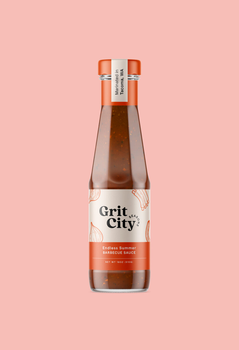
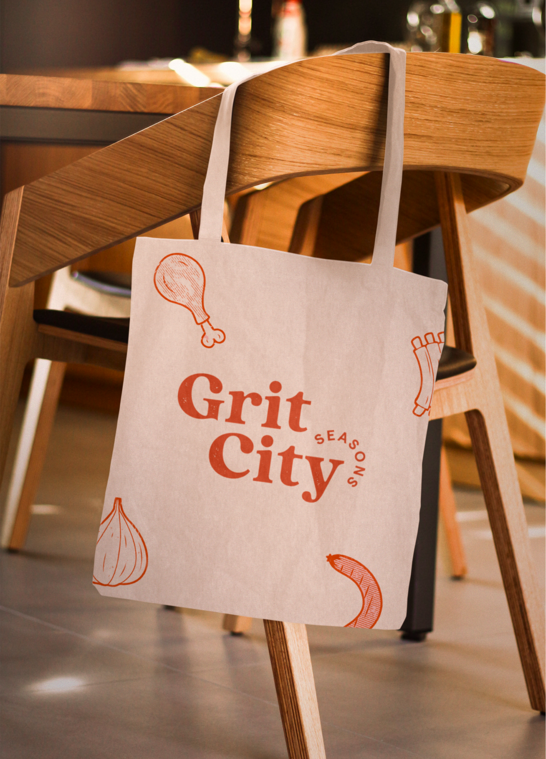
We created a full brand identity for Grit City Seasons, plus a label for their first official sauce release.


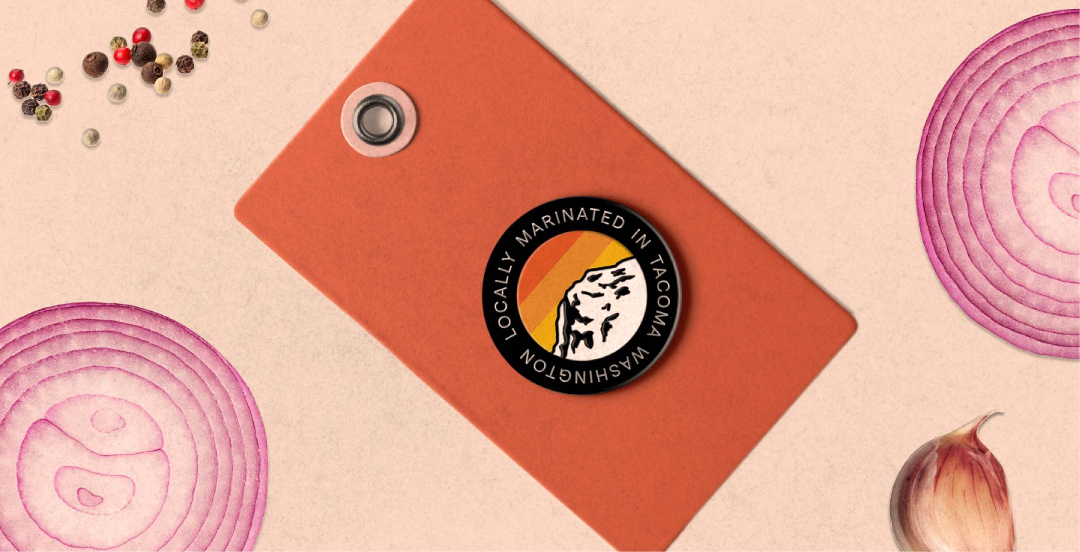
COLOR SYSTEM


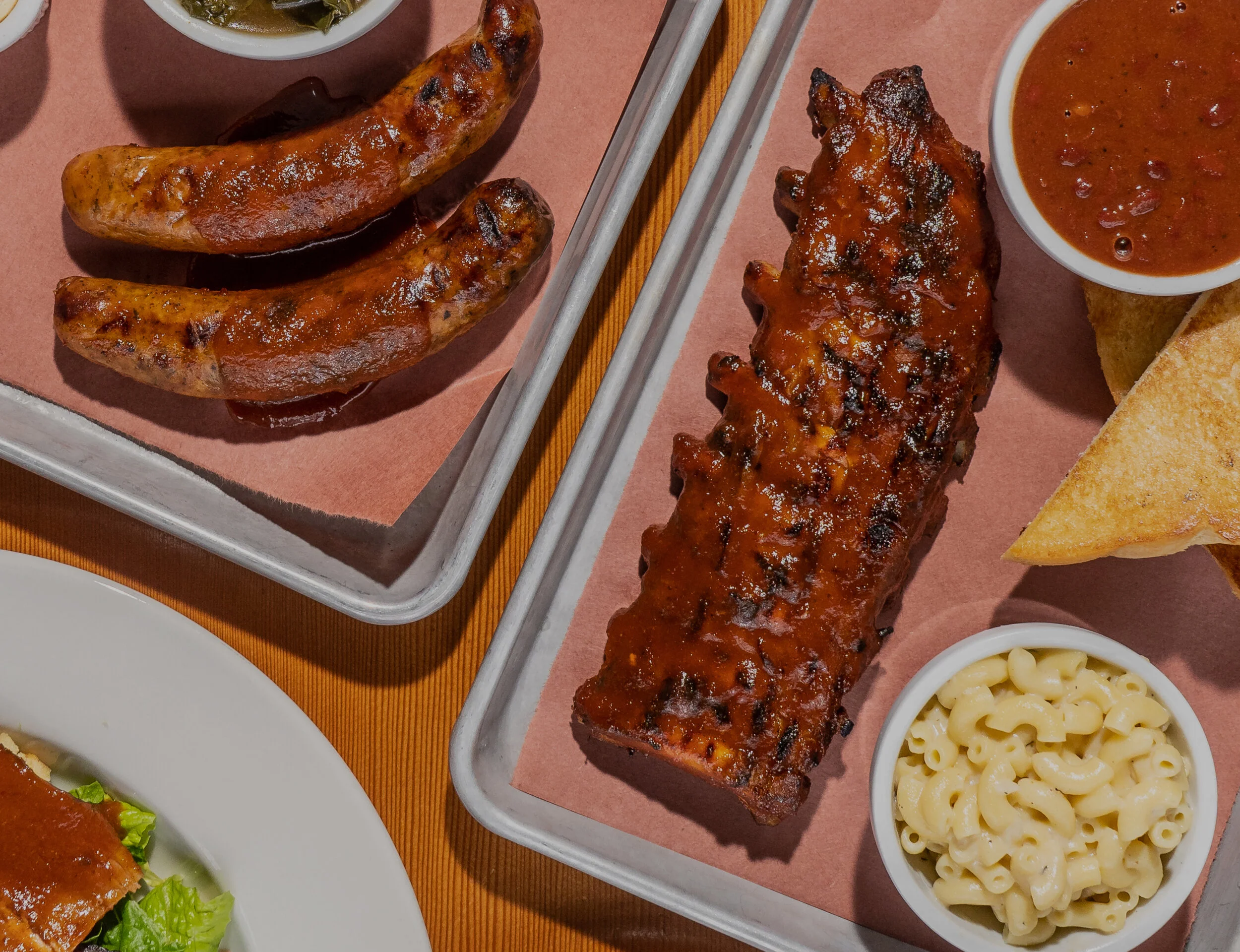
Crowned with the nickname for Tacoma, Washington, the city the founders call home, Grit City Seasons is a family-owned sauce and seasoning company creating community over plates of the Pacific Northwest’s best barbecue.
Grit City Seasons’ brand identity is warm and inviting, comforting and a little familiar, just like the smell of a grill cooking up your favorite foods at a summer barbecue.


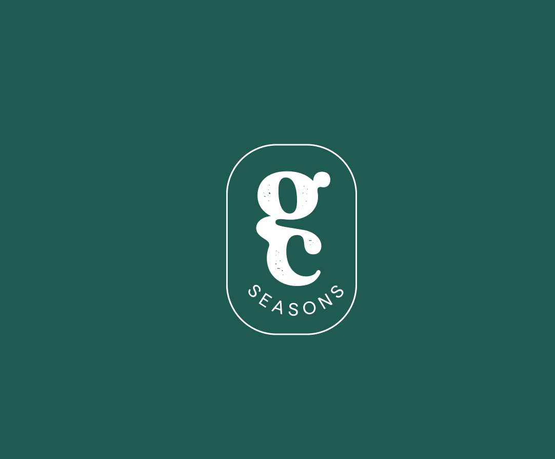
In crafting a brand identity that represented the couple who founded Grit City Seasons and the city they love, we set out to create a look that would stand out on shelves, call out to you at the farmer’s market, and pop when shopping online. Together, the logo, colors, typeface, and patterns convey a retro, home-cooked feel that invites you to gather around and stay a while.

Peruse more projects and collaborations
with other incredible clients