

Nanopath
BRANDING + WEBSITE
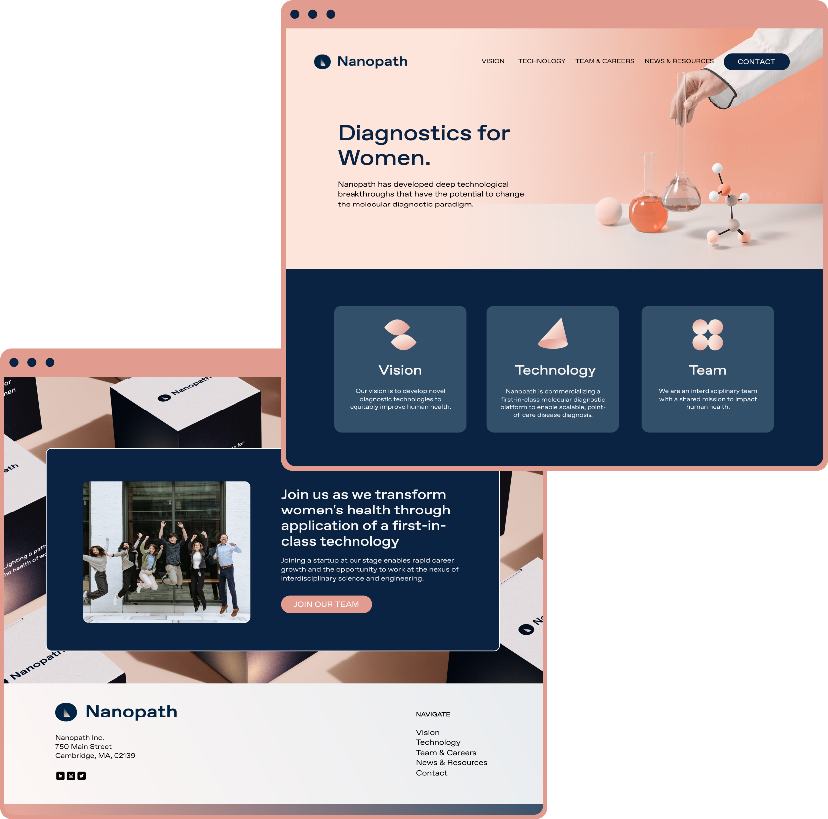
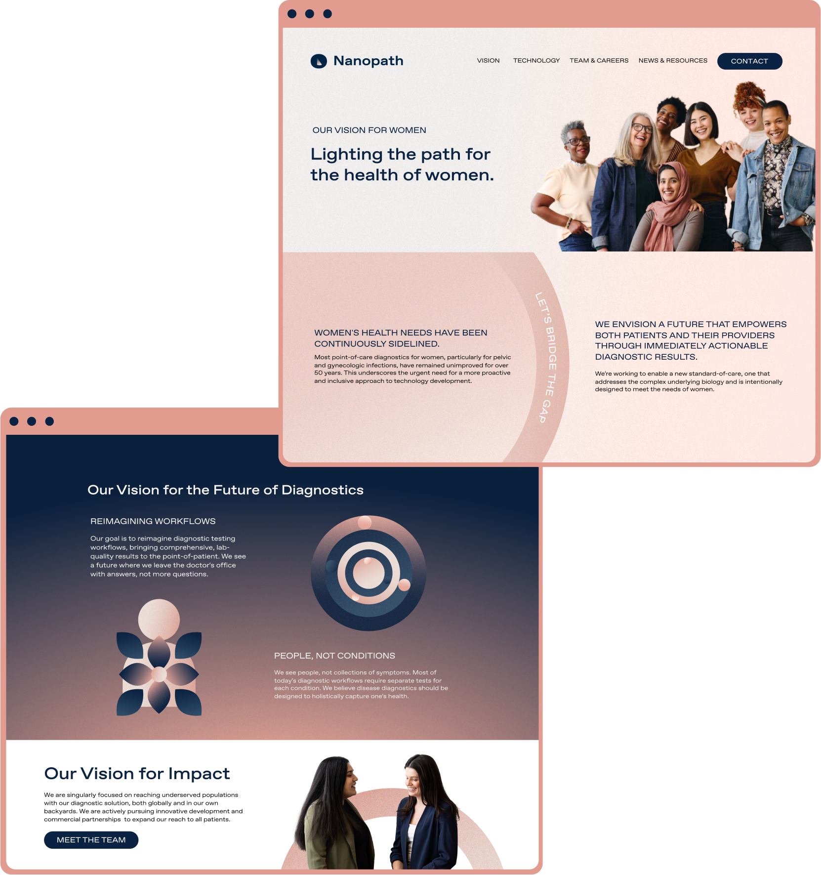
We created a full brand identity and website via Squarespace for Nanopath, a molecular diagnostics company improving the health of women through on demand health information.
Nanopath’s tagline “Lighting a Path for the Health of Women” inspired the visual brand direction. The space underneath the N, became the anchor for a symbol of a spotlight utilized across the logo system and translated into a gradient spotlight pattern we used across assets.


Nanopath had multiple audiences to address: investors, medical institutions, and their end benefactor: women in need of diagnostic testing.
We chose a type and color system that spoke to the consumers but that felt magnetic to the other audiences.
We brought in the original brand pink, as they were already known in the biotech industry for using this color, but helped to neutralize it with darker blue hues, to feel more unexpected in the female sciences space.

Website Design
We organized a custom brand photography shoot to build content prior to kicking off the Nanopath website phase. Since the bulk of the photoshoot focused on the founders and lab location, we were able to suplement brand imagery that spoke better to the consumer audience throughout the main marketing landing pages.


Schedule a free consultation to see what we can make for you
FOLLOW US @TRIBUTARY.DESIGN
FOLLOW US @TRIBUTARY.DESIGN