

Curie
BRANDING, PACKAGING, WEBSITE, ART DIRECTION
We’ve been working with Curie since the beginning: starting with a full rebrand, website design, and packaging design for their flagship product: natural deodorant.
Since then, we’ve designed the rest of their line of better body basics, redesigned their website, and designed the set for their Shark Tank pitch.
Packaging
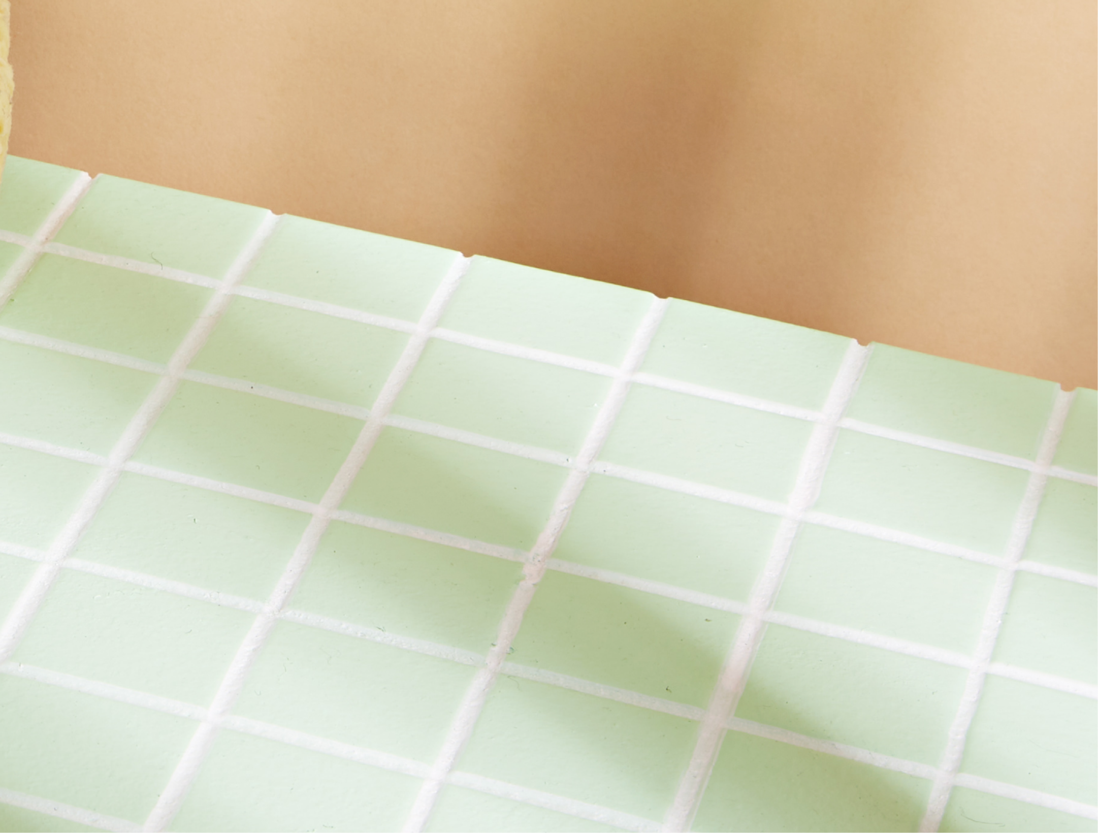
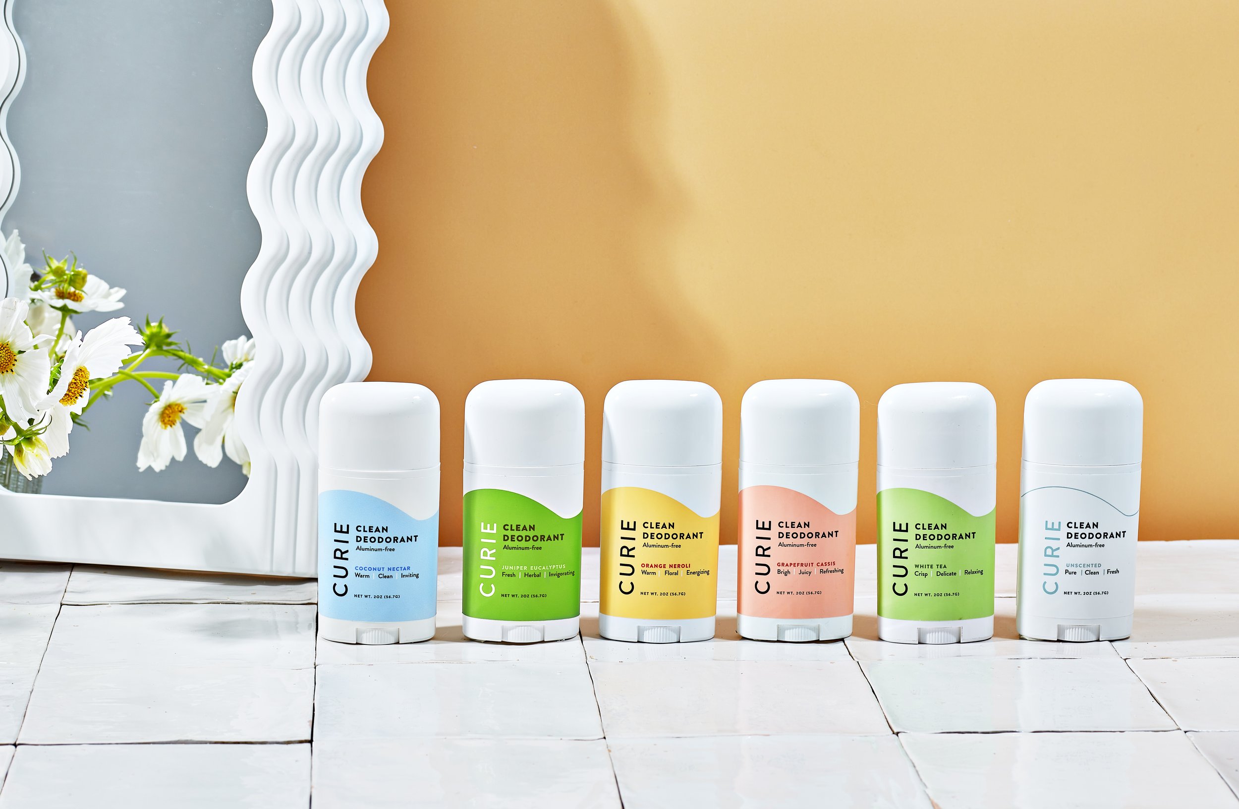
The life-like signature Curie curve on the brand’s flagship natural deodorant was designed as an intentional wink to its audience of active consumers. We’ve worked to bring in some element of human movement to every product label since, working with each unique packaging type, from bottles to tubes to tubs.
The brand colors were selected to communicate each scent’s unique palette and personality on their own. Viewed as a collection, they convey the brand’s sunny disposition.
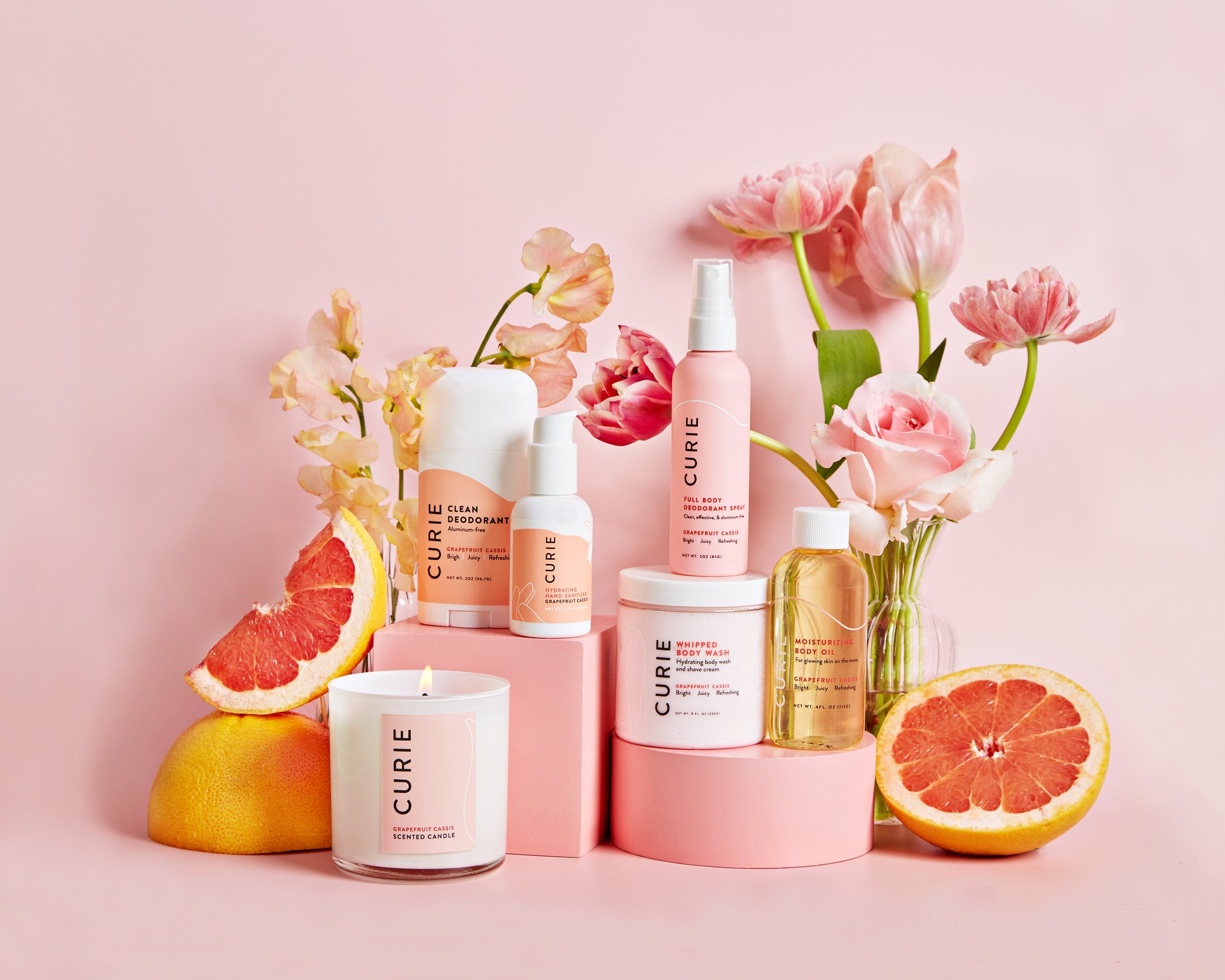
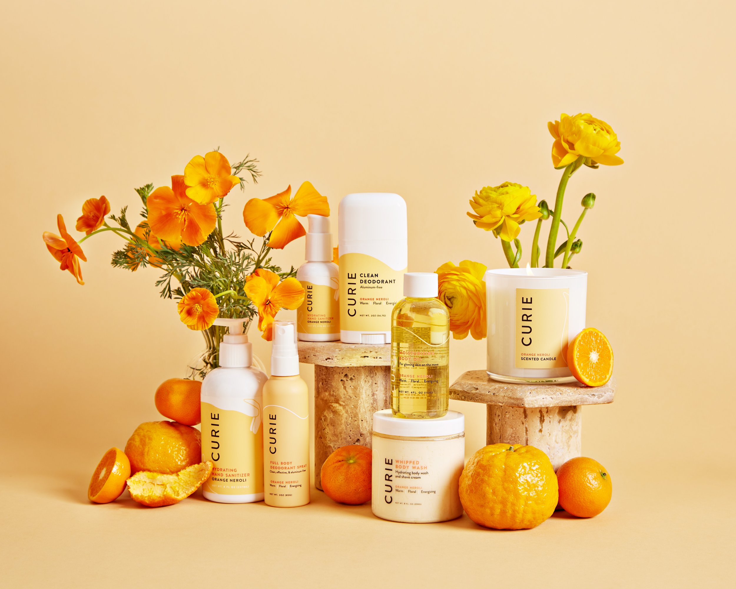

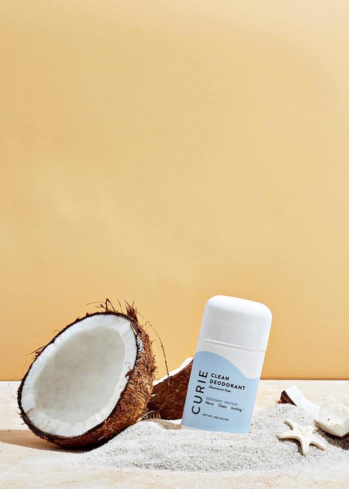
Natural Deodorant
Curie’s flagship product was formulated with clean ingredients. And actually works. The curved design on the label was inspired by the curves of a body. Unravel it, and you can see the silhouette of someone arching and lifting their arm, readying to apply deodorant... or maybe dance.


Hand Sanitizer
This launch provided an opportunity to expand on the idea of the original curved label design. For the Hydrating Hand Sanitizer, we chose an abstract hand shape with whitespace to maintain visual consistency with the other labels.
Considering future products would not all have a similar cylindrical bottle shape, we introduced linework at the base of the label to open up options for later launches and unique packaging.


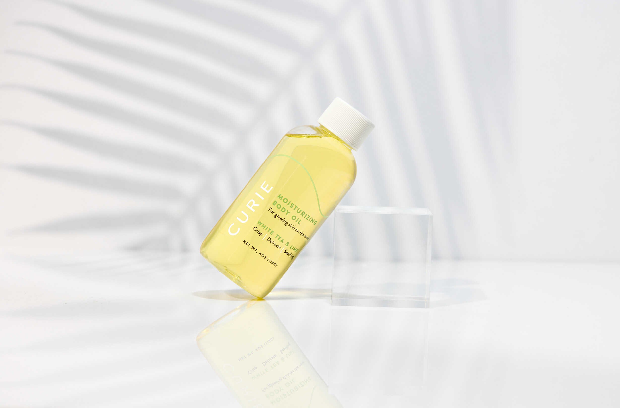
Body Oil
For Curie’s first clear bottle, we paid special attention to legibility of text and pattern. We implemented the linework first introduced with the Hand Sanitizer combined with the shape on the natural deodorant as this product is intended for all-over use.


Spray
Deodorant 2.0
For the revamp of Curie’s spray deodorant, we worked closely with the team on the right packaging for this particular product. We explored clear bottles, but the natural scents tinted the products causing an inconsistent look. Ultimately, we went with screenprinting on PCR bottles, which presented new challenges for color accuracy. After 6 months of testing, we landed on altered Pantones and a matte coating to elevate the overall look and get the perfect hues to complement the signature scents.
The linework we established in earlier product lines proved to be an important element of our brand toolkit as as color blocking was not an option with this printing technique.


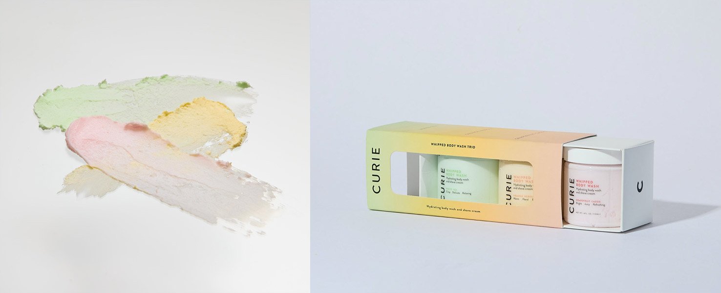
Whipped Soap
This product was all about bringing fun into your personal care routine. We tested coloring the whipped soap itself inside a clear jar to let the product really stand out at home in customer’s showers.
We also worked on a custom piece of packaging for the trio when customers purchase all 3 scents together.

Detox Mask
This product introduced a new category in the Curie family: unscented. For the Clay Detox Mask, we brought in the linework recently added to our brand toolkit during the Hand Sanitizer launch. We reworked the shape to resemble the profile of a face, tying in the product’s main use case. For the color selection, we focused on the mask’s primary ingredient, charcoal, instead of scent.


All videos are courtesy of Nick Kova. Images are courtesy of Nick Kova, Ashley Batz, and Tracie Davis.
Website Design
Our original website designs focused on the same linework found across Curie’s packaging to bring movement to their digital platform. In our latest website redesign, we introduced a new curved typeface and new shapes to further imbue the brand’s real-life energy into their digital presence.
Peruse more projects and collaborations
with other incredible clients